Listening to Chance
I recently came across a paper Projecting confidence: How the probabilistic horse race confuses and demobilizes the public written by some of my relatively distant ex-colleagues at Facebook analyzing the potential impact of probabilistic election predictions (Nate Silver style) on public voter turnout. They hypothesized that the concept of probability in election outcomes is inherently hard to understand and can thus lead people to underestimate the closeness of the race. The authors were able to confirm many of their findings experimentally. More discussion of the article can be found in this excellent post from Columbia stat modeling goes further in depth for those interested.
I think the concept of chance is pretty interesting. A 50% chance of winning an election means that if we were to re-run the election 1,000 times in a lab, that we would expect roughly 500 victories for candidate A and 500 victories for candidate B. But in real life, we only get to see one outcome. Clinton was given an 85% chance of winning in 2016 - the fact that she lost doesn’t necessarily make the predictions incorrect. The concept is, as the researchers point out, really quite unintuitive.
At the same time, despite the unintuitive (and possibly deleterious nature!) of probability forecasts on civic outcomes, we see and hear predictions of outcomes constantly in the media. As a mini project this week I decided to take a look first at how often the concept is used, and second at interesting ways to perceive that information.
The first step was to download all of the transcripts of CNN shows aired in 2016 from the TV News Internet Archive. I limited the dataset to the year 2016 (for obvious reasons) and the network to CNN just to focus on a manageable amount of material aimed primarily at left-leaning audiences (the paper observes that this kind of coverage is more prominent in left leaning news sources). Afterward I used grep to pull out all the lines containing the word “chance” and then wrote a short python script to count the occurrences and group them by date. I threw the data into a spreadsheet for a quick graph (haven’t got around to setting up Jupyter locally just yet).
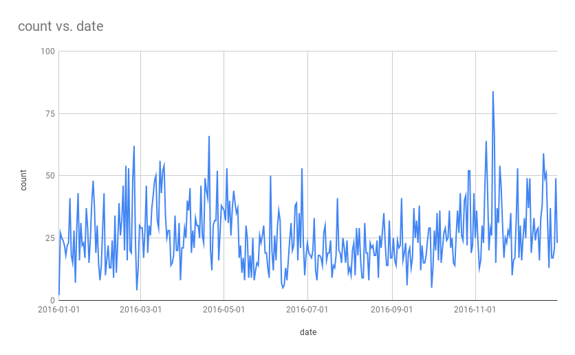
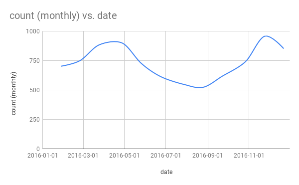
Once I had a rough dataset (with peaks around the primary and elections, somewhat surprisingly given that this is all coverage mentioning chance in any context whatsoever) I went on to craft a simple data sonification using the sound of a coin spinning on a table. The number of mentions in each month correspond directly to the number of spinning coins that the listener can hear.
Enjoy!