Visual Language - Logo
![]()
Process
The most challenging question is deciding what primary context this logo is for. While I juggle multiple skillsets and identities, and even take pride in the multitude of contexts I can operate in, I decided to make some cuts to focus on the creative technical and artistic realm - the context I expect to operate in most at ITP. This area is still quite broad!
Next, I thought through how I would like to present myself as a creative technologist/technical creative/what-have-you. I generally have trouble with these kinds of questions and found it helpful to ask a mirrored version: how would I like to be known as a creative technologist/etc. etc?
I came up with the following attributes:
- Elegance through minimalism
- Deep technical background, but sense of aesthetic
- Unconventional approaches, but grounding in traditional methods
- Multifunctional, multiuse
Looking at this list I decided to start with abstract, minimalist, geometric iconography to convey both a sense of elegance and technicality. Although I didn’t want to squeeze climbing into my brand (at least for now), I did take the time to draw some inspiration from some of my favorite climbing brands, which generally matched the aesthetic sensibility I was looking for.
![]()

After a few sketches I had three main candidates:
![]()
This logo is an abstraction of a square and its shadow, a potential representation of “extending dimensionality.” My girlfriend pointed out to me that it looks like an open laptop, which I hadn’t realized at all. But of course it does, and although that is relevant to the theme of creative technology I didn’t want to associate with laptops specifically quite so strongly.
![]()
This logo is an abstraction of my initials, and also happens to form the symbol for a diode in electrical schematics. However, the shape isn’t ultimately that interesting and again I found the connection to schematics a little bit too on-the-nose to feel comfortable.
![]()
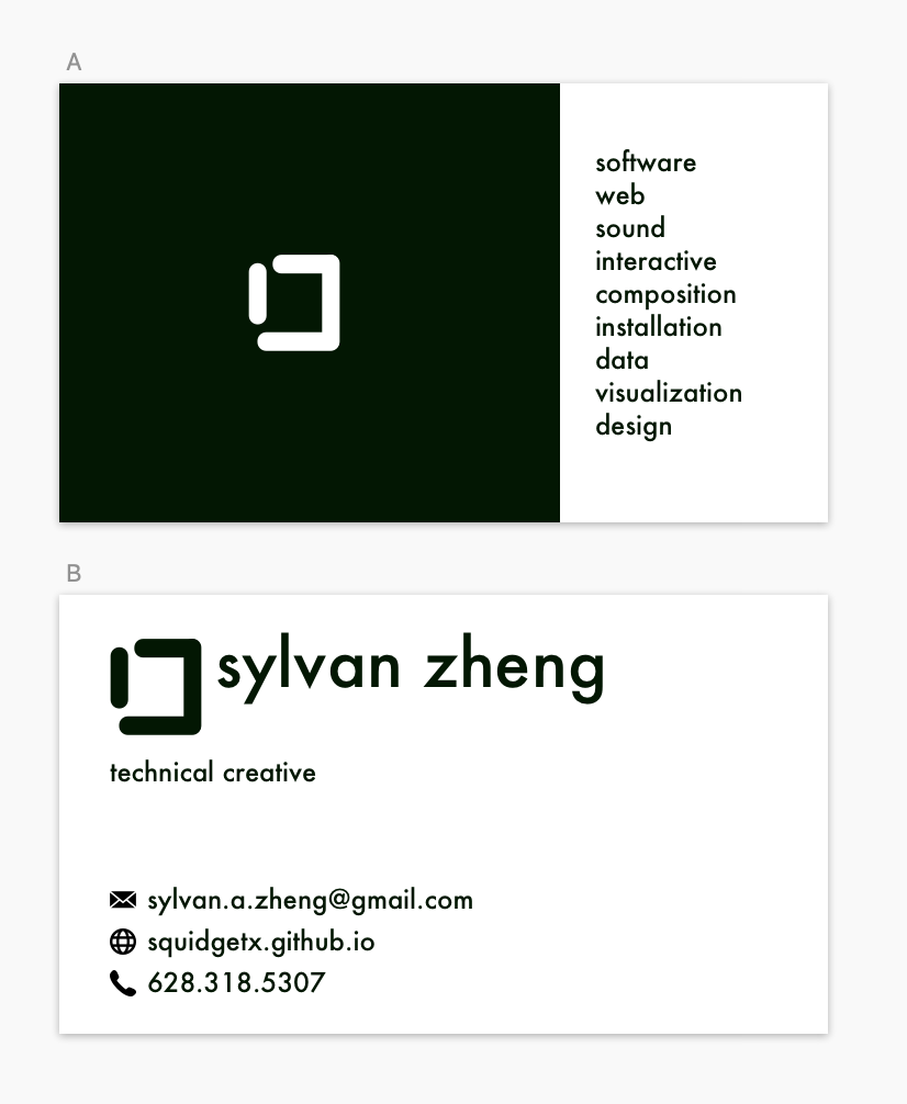
This logo is just a broken box. I initially drew it as a one-off sketch, but I enjoyed the subtle associations it carries of “breaking boundaries” and “outside the box.”
I settled on a monochrome theme (primarily used as a dark green to give off a healthy hint of deep forest) to further emphasize the theme of technical minimalism. I eventually chose Futura as the font to give a nod to the long history of creative technical media, but tracked the letters slightly closer together to give it a bit more cohesive feel and personal spin.
This website’s header and favicon are now updated with the new logo! I additionally took a crack and drafting a business card with the same logo and sensibility.