Visual Language Design Analysis - Watchmen
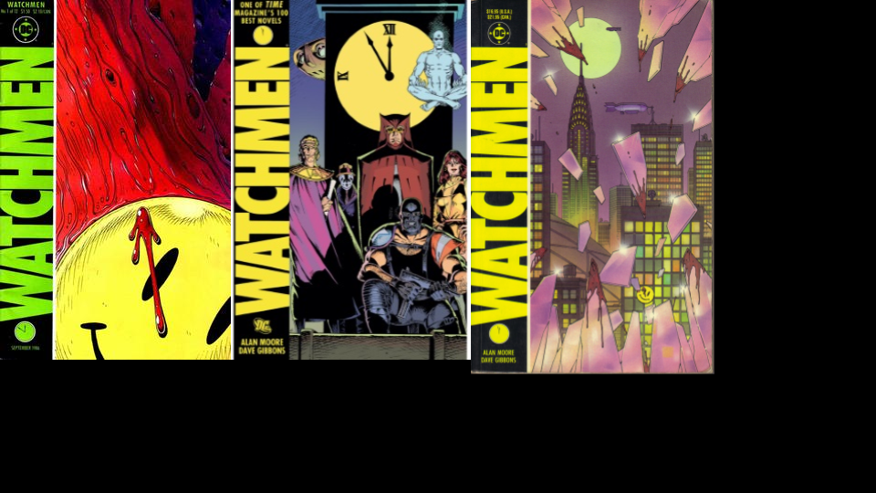
Watchmen by Alan Moore and Dave Gibbons is a fantastic graphic novel heavily centered on themes of irony and contradiction. The cover art on its own is iconic due to its successful adherence to simple design guidelines as well as a few aesthetic choices that further reinforce the themes of irony and contradiction. This post will go into some detail analyzing these key choices.
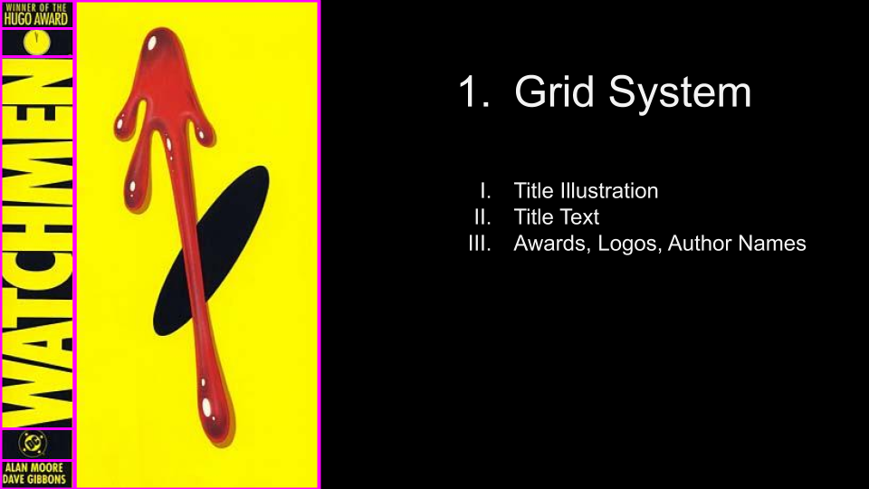
First, we’ll look at the high-level grid that is used to organize the elements of the cover. It’s a relatively simple design that uses two columns; title text and other metadata on the left and the title graphic on the right. Note how the relative size and position of the grid elements underscore the hierarchy of information being conveyed - the title and title graphic get the most text, while the author’s names, the DC logo, and the watch face are given secondary billing.
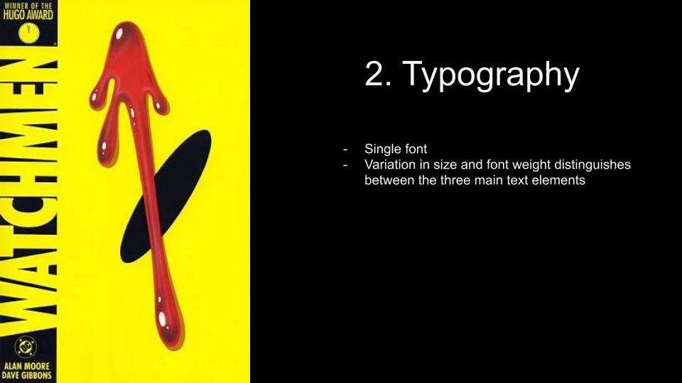
There is a single font used throughout the cover design - a bold, condensed sans-serif all-caps font roughly reminiscent of the font used in caution tape and other warning signs. (We’ll expand more on this similarity later on in this post.) The design uses differences in size and font weight to further organize and distinguish between the three main text elements.
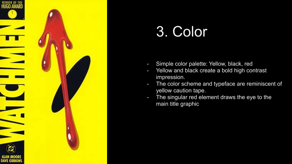
The cover uses a simple color palette of just three main colors: yellow, black and red. Together with the font choice the yellow and black strongly reinforce the connection to warning or caution tape! This lends a tense energy to the cover design, broken by the bold splash of red which sits at the rough center of the cover. In the next section we will dive more deeply into the title graphic itself.
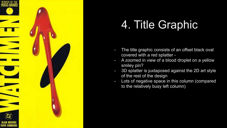
The title graphic consists of an offset black oval covered with a red splatter. Unlike the rest of the design, the red splatter is drawn with shading and highlights that suggest a 3D character. The title graphic, aside from these two elements, is fairly empty of other visual pieces. This contrasts with the left hand column, which is relatively densely packed. This allows the eye to linger on the somewhat abstract but foreboding character of the title graphic. The red splatter is certainly blood, and combined with the caution-tape reminiscent design of the rest of the cover already succeeds in telling a story. Something is wrong, despite warning signs and cautionary efforts. The black oval, disconcertingly tilted, lends further unsteadiness to the image. We are looking at the eye of a smiley face pin or sticker, another piece of iconic yellow and black imagery. This carefree, childlike cartoon symbol of happiness has been stained with blood. It stares unblinkingly at us, the audience. This illustration ties together themes of violated innocence, unsteadiness and calm, accusation and guilt in a clean and incredibly simple way.